bayard farms
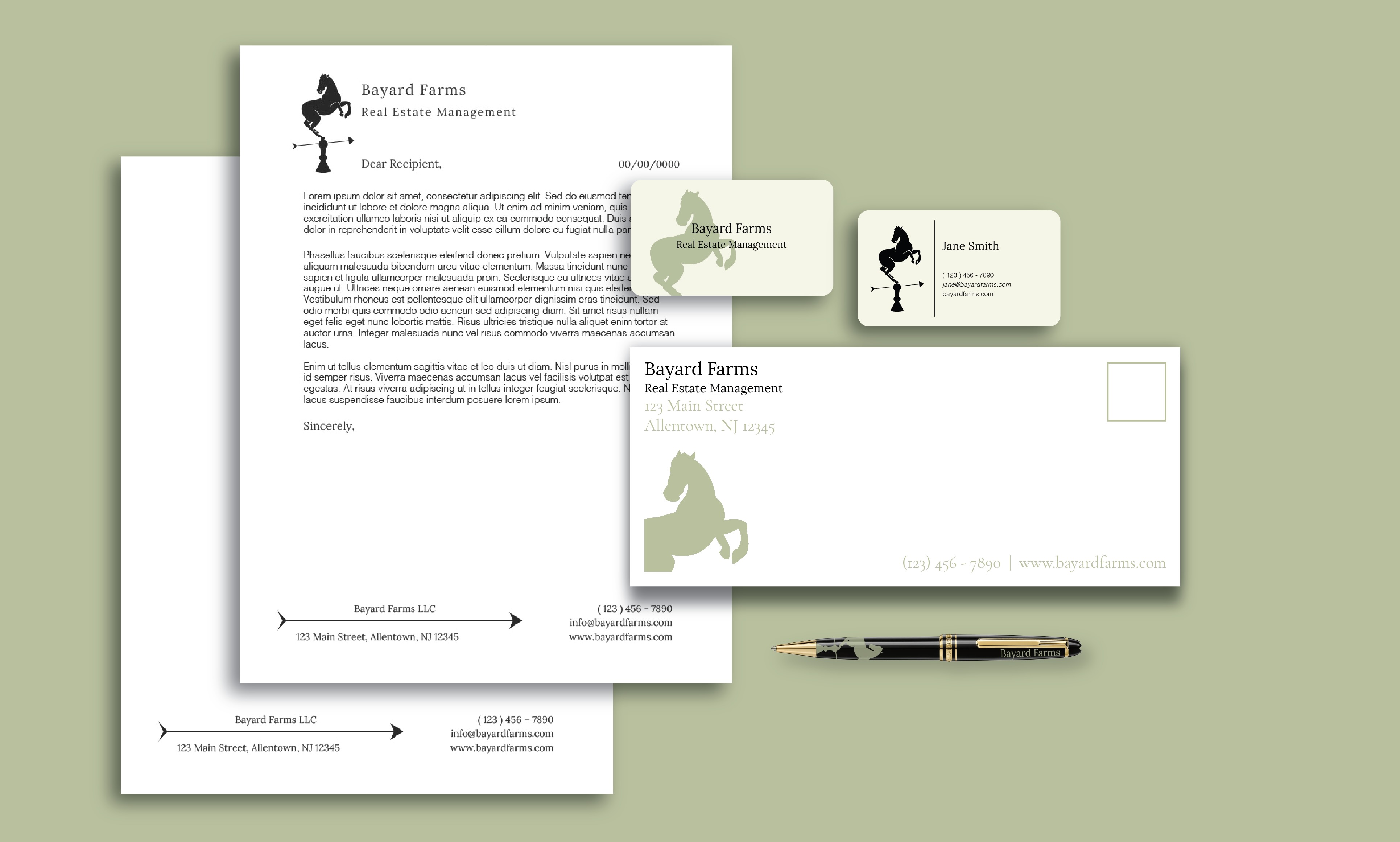
A logo design and brand identity creation for Bayard Farms LLC, a real estate management company
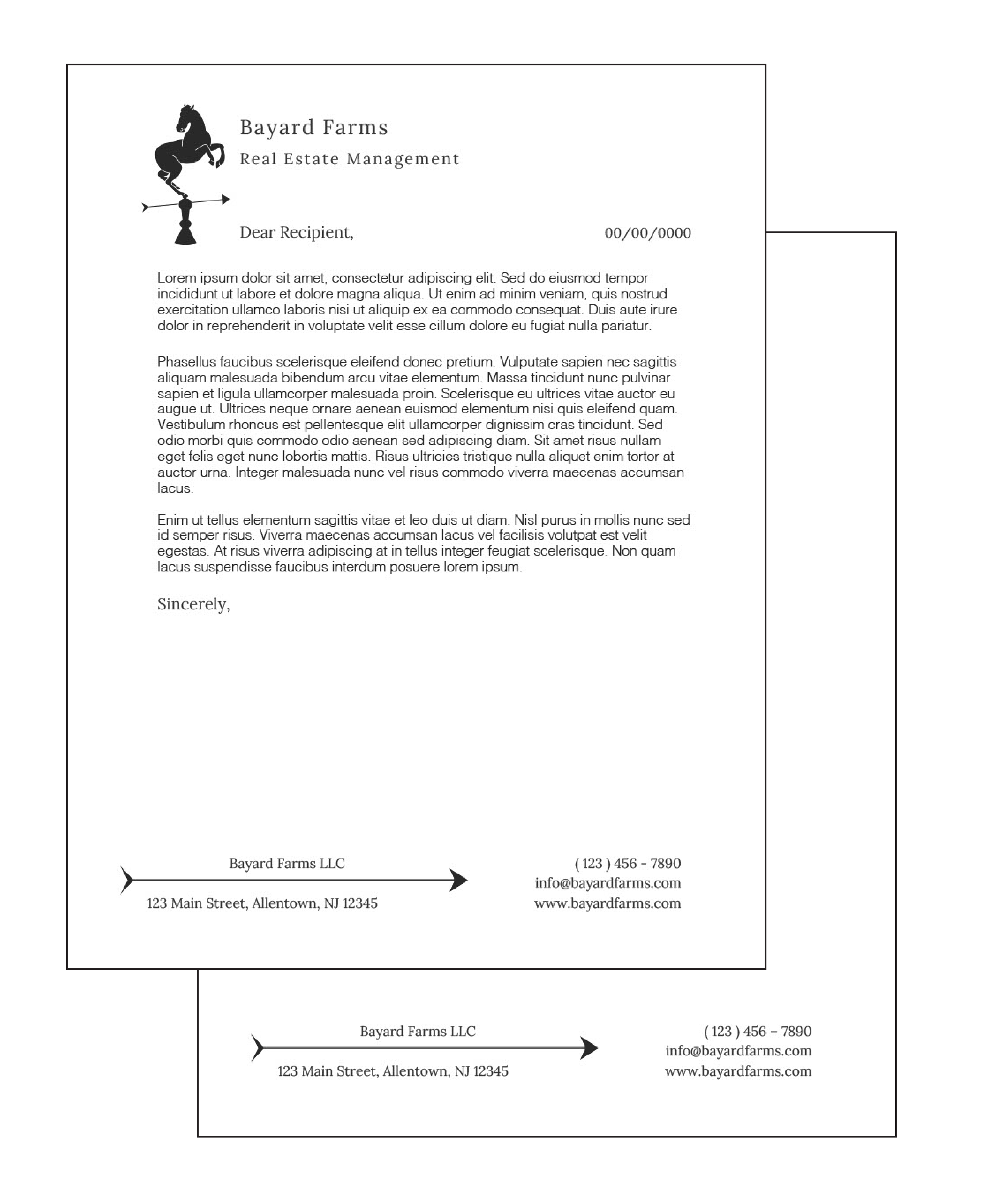
Deliverables: logo design, visual system guidelines, printed assets, digital assets
about :
Boilerplate/Mission :
Bayard Farms is a family-founded and family-run real estate management company. With extensive experience in managing both residential and commercial properties, we bring a broad range of expertise, professionalism, and empathy to every interaction.
Our Values :
Bayard Farms is dedicated to delivering exceptional service and personalized attention to our clients. We pride ourselves on building lasting relationships and creating a positive impact in the communities we serve.
logo :
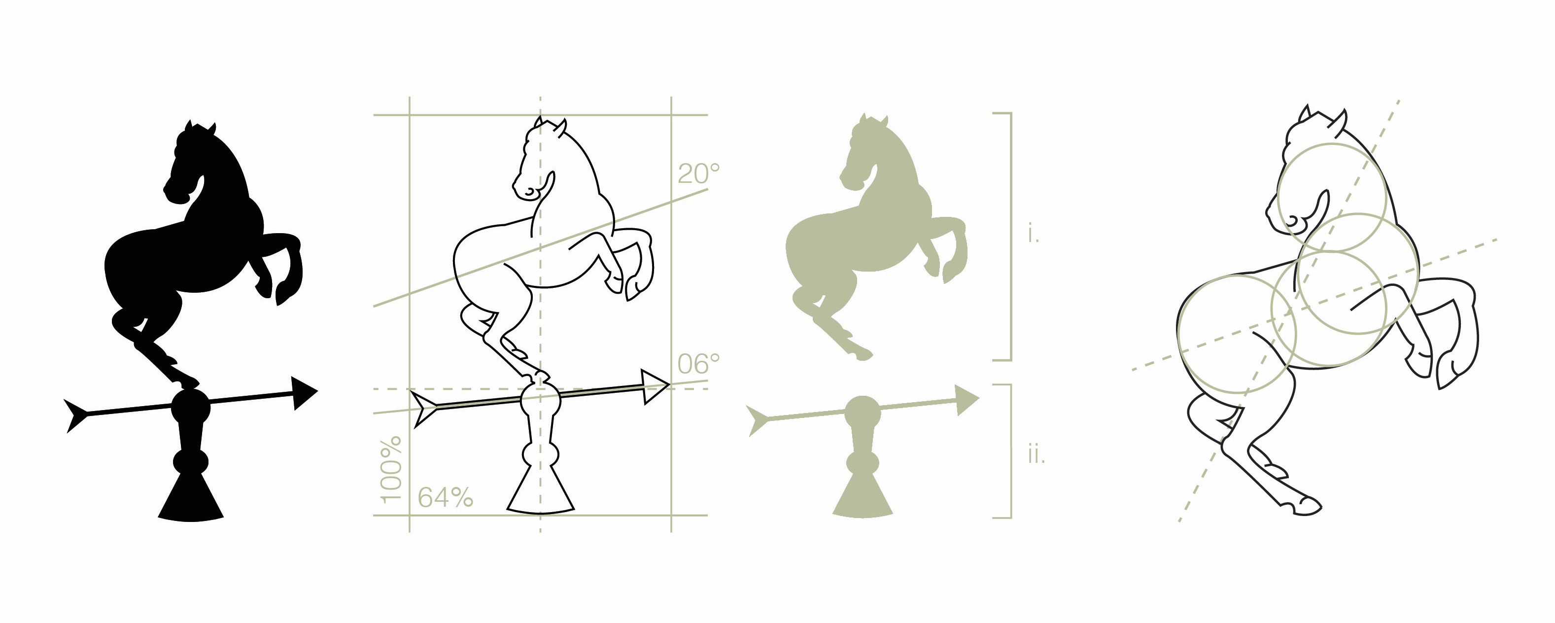
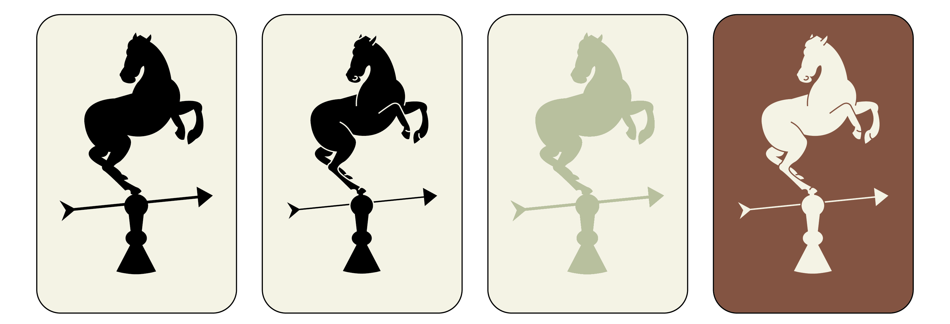
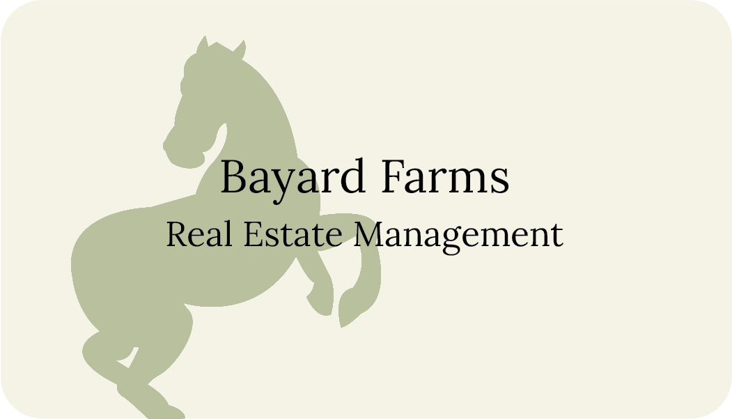
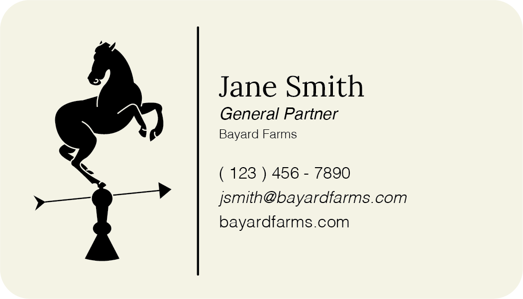
The Bayard Farms logo features a horse on a weather vane, a symbol that can be presented either as a silhouette or a silhouette with the details of the linework subtracted from the shape.
The Horse :
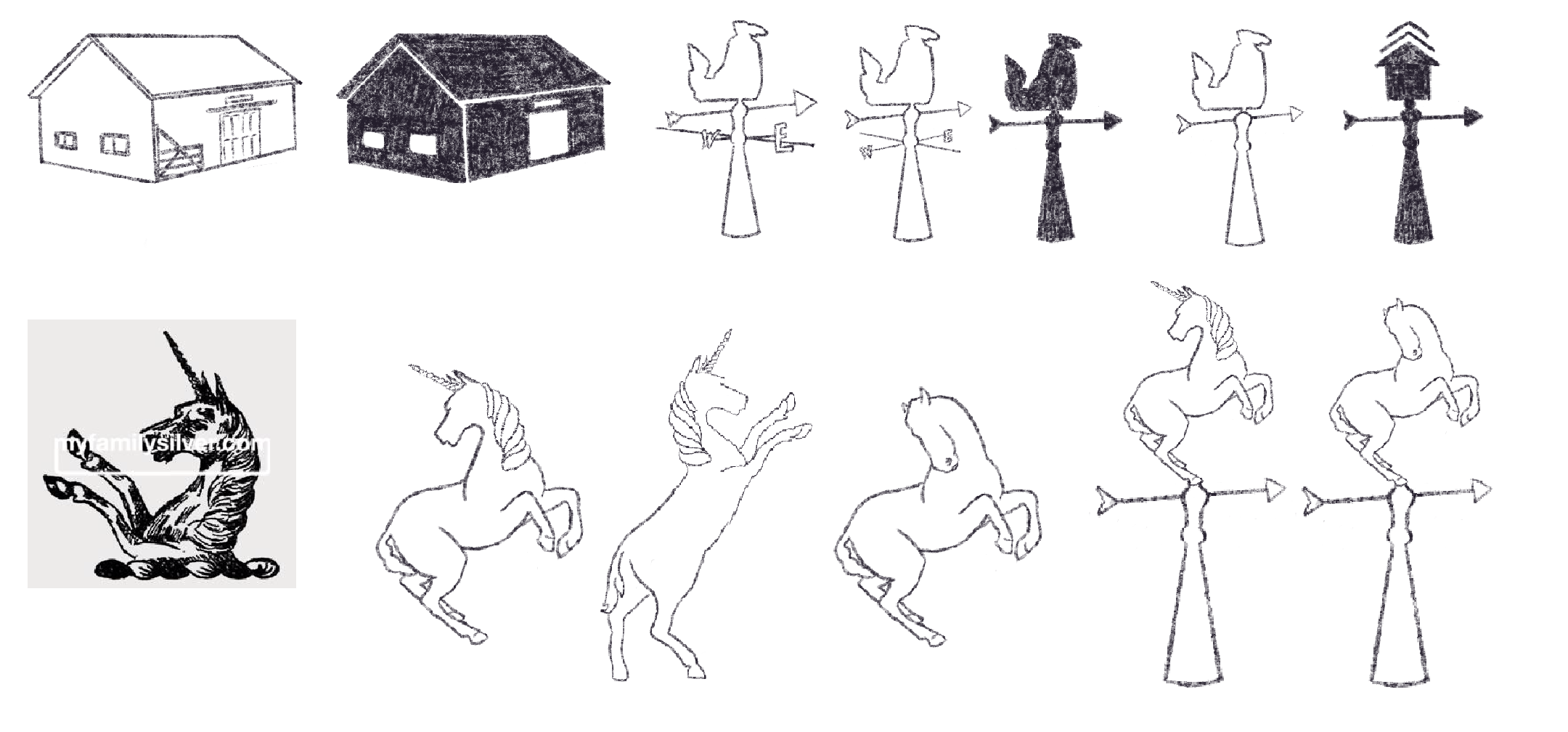
The horse in the logo is inspired by the Bayard family crest and the legendary Bayard, a magical bay horse celebrated for its intelligence and adaptability. In the legend, the horse was capable of carrying the four sons of Aymon simultaneously. In our logo, the horse represents strength, diligence, and the connection between humans and nature. The rearing horse symbolizes power, but its posture is intentionally moderated to convey control and composure, differentiating it from a fully rearing horse.
The Weather Vane :
The stand of the weather vane in the logo is modeled after a weather vane that sits on the bookshelf at Quarry Hill Farm, part of what inspired the name Bayard Farms. The weather vane itself is a symbol of direction and guidance. For visual simplicity, the stand has been shortened, the cardinal directions have been omitted, and the arrow has been subtly tilted upward. This upward tilt signifies growth and continuous improvement, reinforcing the Bayard Farms’ commitment to progress and excellence.
typography :
Lora is a friendly yet classic serif font, chosen for its unique blend of traditional and contemporary elements. The typewriter-like features of Lora add a touch of nostalgia, evoking a sense of timelessness and reliability. The font's thickness ensures that it remains easily readable, while the subtle roundness of its characters introduces an element of approachability and warmth. This balance between structure and softness allows Lora to communicate a more natural and welcoming air, making it an ideal choice for creating content that feels both personable and professional.
To complement the primary serif font, we chose Helvetica (Light) as our secondary sans serif font. This typeface is renowned for its clarity and readability, making it an ideal choice for body text. Its clean, straightforward lines provide a perfect counterbalance to the more ornate Cormorant Garamond, ensuring that the overall design remains accessible and easy to navigate. Additionally, Helvetica is widely pre-installed on most software platforms, ensuring consistent rendering and accessibility across various devices and applications.
color palette :
Classic black has been chosen as the primary color for the majority of our text. Its timeless and versatile nature provides a strong foundation for the rest of the palette, ensuring that all text is easily readable and visually grounded. Black's inherent sophistication and clarity make it an ideal choice for conveying information in a professional and authoritative manner.
Light green has been chosen to reflect the natural, farm-focused essence of our brand. Green is universally associated with nature, symbolizing growth, luck, and wealth. The selected soft hue of green adds a layer of formality, ensuring that the color remains professional while still evoking a sense of calm and rejuvenation.
Off white serves as a complementary color, providing a soft, neutral background that supports and highlights the other colors. Unlike stark white, this subtle shade introduces a clean and formal space that avoids feeling clinical or harsh. Its gentle tone helps to reduce visual fatigue in digital settings but is not essential for print materials.
Dark brown is another natural color that complements the light green, providing a bold yet harmonious contrast. This specific hue of brown is chosen for its solid and sturdy appearance, reflecting reliability and strength. Despite its robust nature, the warmth inherent in dark brown introduces a welcoming and grounded feel to the palette.
 bailey foltz
bayard farms
A logo design and brand identity creation for Bayard Farms LLC, a real estate management company
Deliverables: logo design, visual system guidelines, printed assets, digital assets
about :
Boilerplate/Mission :
Bayard Farms is a family-founded and family-run real estate management company. With extensive experience in managing both residential and commercial properties, we bring a broad range of expertise, professionalism, and empathy to every interaction.
Our Values :
Bayard Farms is dedicated to delivering exceptional service and personalized attention to our clients. We pride ourselves on building lasting relationships and creating a positive impact in the communities we serve.
logo :
The Bayard Farms logo features a horse on a weather vane, a symbol that can be presented either as a silhouette or a silhouette with the details of the linework subtracted from the shape.
The Horse :
The horse in the logo is inspired by the Bayard family crest and the legendary Bayard, a magical bay horse celebrated for its intelligence and adaptability. In the legend, the horse was capable of carrying the four sons of Aymon simultaneously. In our logo, the horse represents strength, diligence, and the connection between humans and nature. The rearing horse symbolizes power, but its posture is intentionally moderated to convey control and composure, differentiating it from a fully rearing horse.
The Weather Vane :
The stand of the weather vane in the logo is modeled after a weather vane that sits on the bookshelf at Quarry Hill Farm, part of what inspired the name Bayard Farms. The weather vane itself is a symbol of direction and guidance. For visual simplicity, the stand has been shortened, the cardinal directions have been omitted, and the arrow has been subtly tilted upward. This upward tilt signifies growth and continuous improvement, reinforcing the Bayard Farms’ commitment to progress and excellence.
typography :
Lora is a friendly yet classic serif font, chosen for its unique blend of traditional and contemporary elements. The typewriter-like features of Lora add a touch of nostalgia, evoking a sense of timelessness and reliability. The font's thickness ensures that it remains easily readable, while the subtle roundness of its characters introduces an element of approachability and warmth. This balance between structure and softness allows Lora to communicate a more natural and welcoming air, making it an ideal choice for creating content that feels both personable and professional.
To complement the primary serif font, we chose Helvetica (Light) as our secondary sans serif font. This typeface is renowned for its clarity and readability, making it an ideal choice for body text. Its clean, straightforward lines provide a perfect counterbalance to the more ornate Cormorant Garamond, ensuring that the overall design remains accessible and easy to navigate. Additionally, Helvetica is widely pre-installed on most software platforms, ensuring consistent rendering and accessibility across various devices and applications.
color palette :
Classic black has been chosen as the primary color for the majority of our text. Its timeless and versatile nature provides a strong foundation for the rest of the palette, ensuring that all text is easily readable and visually grounded. Black's inherent sophistication and clarity make it an ideal choice for conveying information in a professional and authoritative manner.
Light green has been chosen to reflect the natural, farm-focused essence of our brand. Green is universally associated with nature, symbolizing growth, luck, and wealth. The selected soft hue of green adds a layer of formality, ensuring that the color remains professional while still evoking a sense of calm and rejuvenation.
Off white serves as a complementary color, providing a soft, neutral background that supports and highlights the other colors. Unlike stark white, this subtle shade introduces a clean and formal space that avoids feeling clinical or harsh. Its gentle tone helps to reduce visual fatigue in digital settings but is not essential for print materials.
Dark brown is another natural color that complements the light green, providing a bold yet harmonious contrast. This specific hue of brown is chosen for its solid and sturdy appearance, reflecting reliability and strength. Despite its robust nature, the warmth inherent in dark brown introduces a welcoming and grounded feel to the palette.
