k&n investors
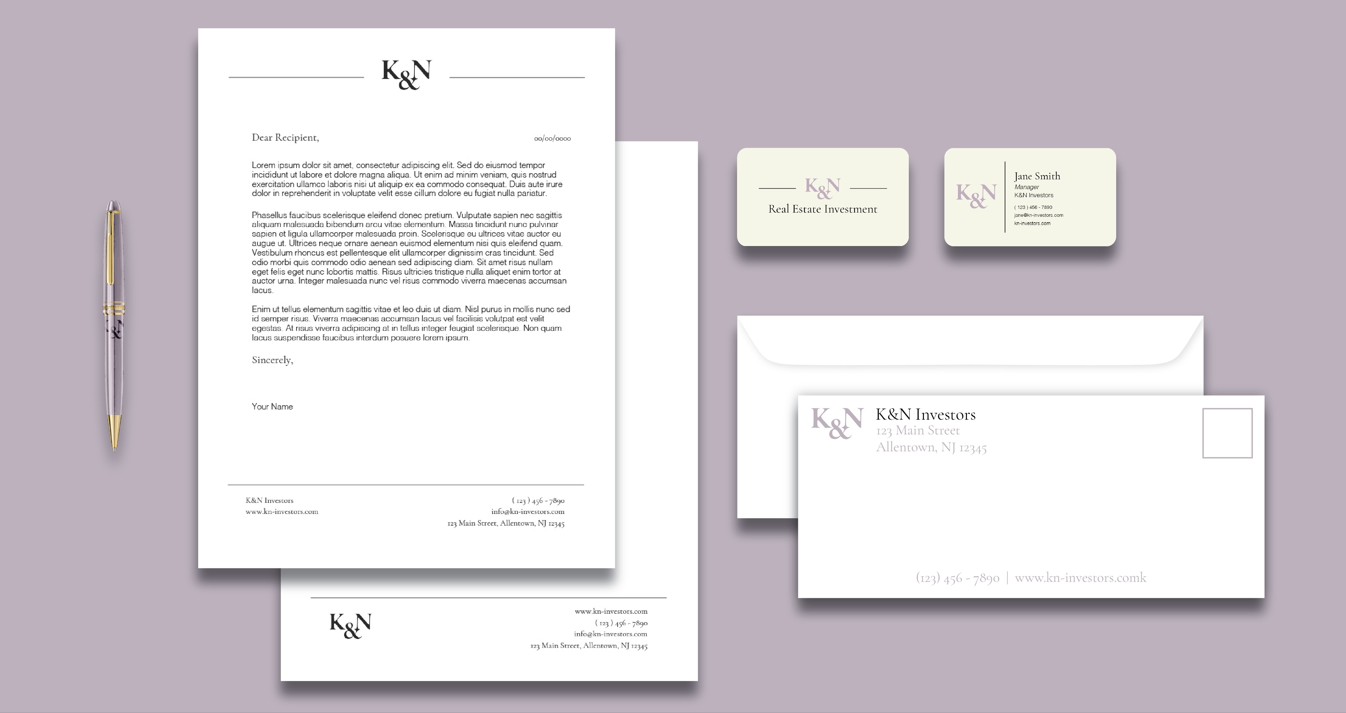
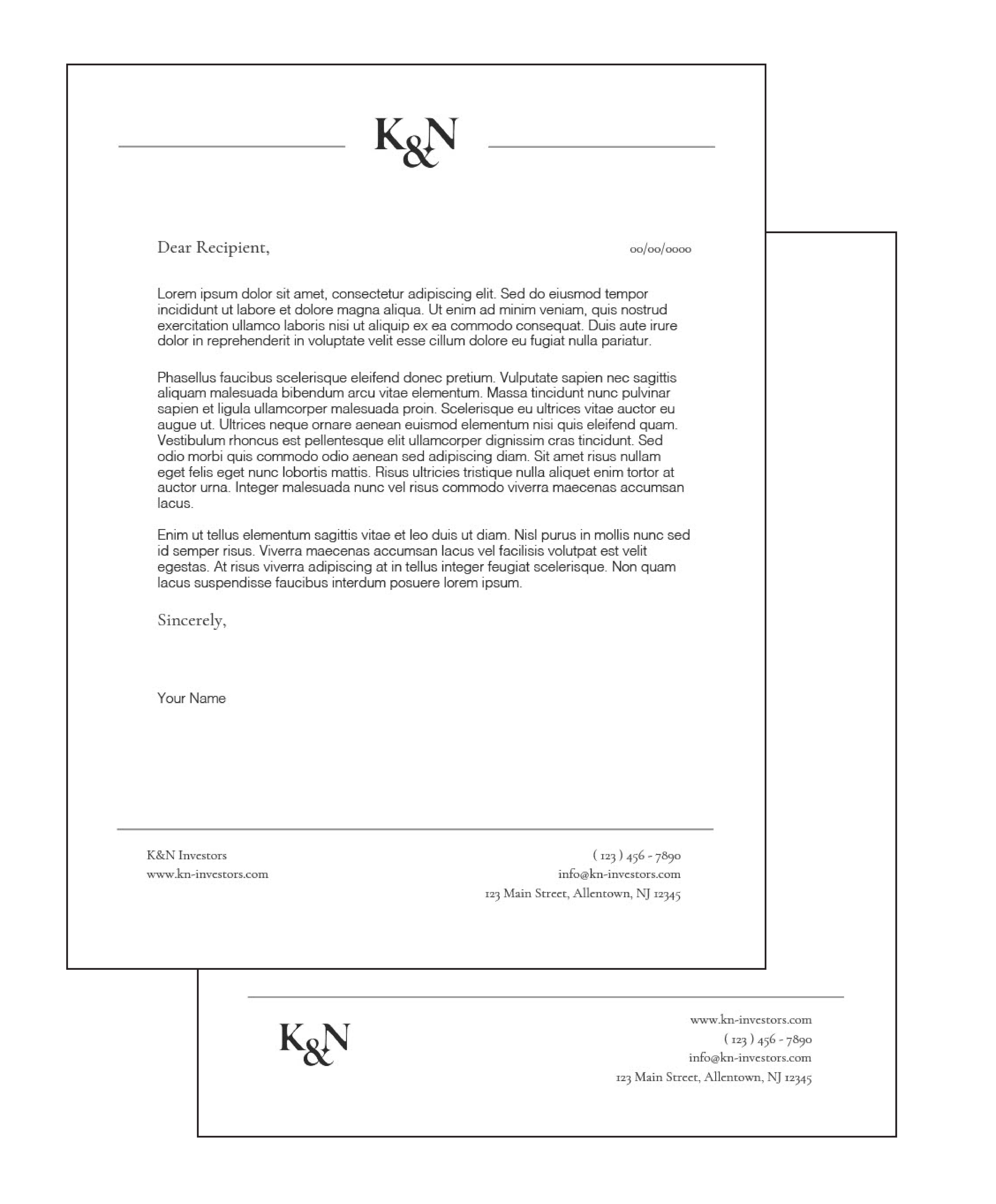
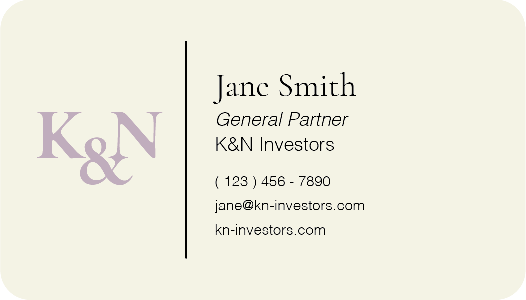
A logo design and brand identity creation for K&N Investors, a real estate investment company
Deliverables: logo design, visual system guidelines, printed assets, digital assets, web design and development
about :
Boilerplate/Mission :
K&N Investors is a family-owned real estate company with a diverse portfolio of properties across the continental United States. Born from friendship and cultivated by family values, K&N is dedicated to creating exceptional [commercial] real estate experiences.
Our mission is to build vibrant communities, uplift small businesses, and stimulate local economies through strategic investments and thoughtful property management.
Our Values :
At K&N Investors, we believe in the power of relationships and the importance of community. Our properties are more than just buildings; they are integral parts of the neighborhoods they serve. Our team brings a wealth of experience and a collaborative spirit to every project, ensuring that our properties are well-maintained, innovative, and responsive to the needs of the community.
Core Tenets :
Family Values
Rooted in the principles of trust, integrity, and mutual respect, our family values guide every aspect of our business. We prioritize creating a supportive and inclusive environment where our partners and tenants feel valued and respected.
Community [and Education]
We believe in the power of community and are dedicated to making a positive impact in the neighborhoods we serve. Our commitment to community means investing in local initiatives, supporting small businesses, and fostering environments where people can connect and thrive.
Relationship-Centric Business Practices
By fostering strong connections with our tenants and partners through relationship-centric business practices, we create spaces that not only meet commercial needs but also enhance the quality of life for all stakeholders.
logo :
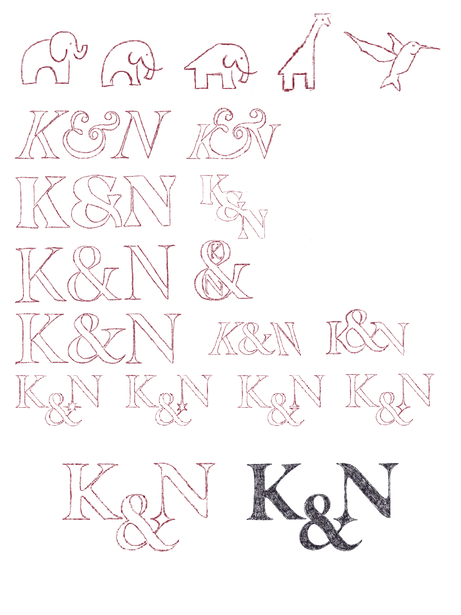
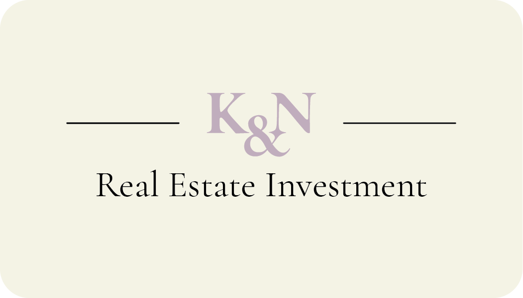
For K&N, we opted to create a monogram logo, a choice driven by the desire for simplicity, professionalism, and memorability. The intertwined letters "K" and "N" serve as a visual representation of collaboration—both the partnership between the original founders, Karl and Nancy, and the ongoing, dynamic relationship between the company and its clients.
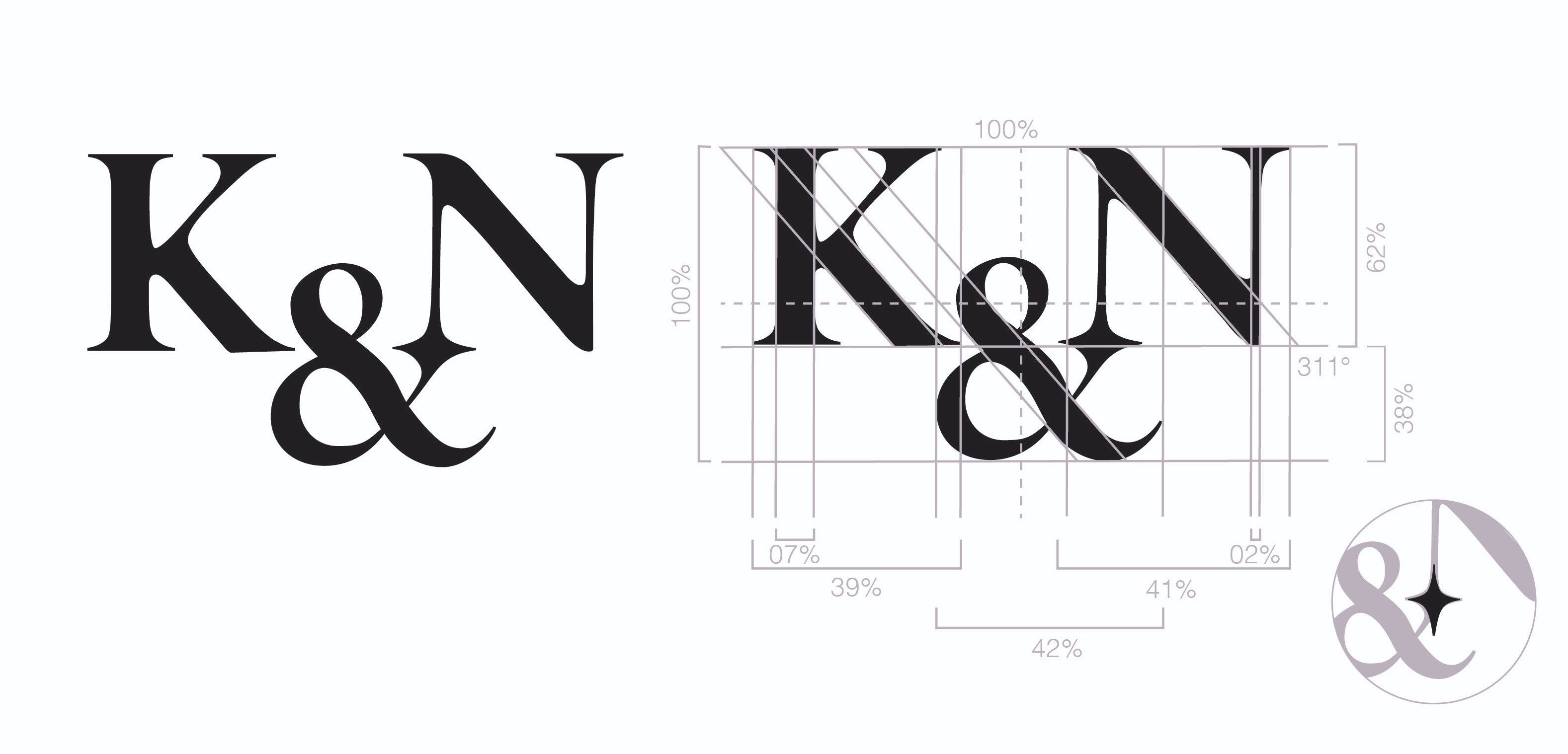
The design is rooted in a serif font, a modified version of ‘Big Caslon CC Regular’, selected to balance formality and approachability. The pointed serif edges convey a sense of precision and professionalism, while the subtle curves within each character introduce an element of friendliness and adaptability. This duality reflects the company's commitment to delivering meticulous and high-quality service, while remaining approachable and flexible to client needs.
A distinctive feature of the logo is the point of combination between the "&" and the "N." This junction converges into four points, two of which extend back into the letters. This star-like shape symbolizes the company's role as a guiding star for their clients. Just as a star offers direction and inspiration, K&N strives to lead their clients towards success and innovation.
typography :
We selected Cormorant Garamond as our primary serif font due to its professional and sophisticated aesthetic. This font is characterized by its thin strokes, which lend an air of formality and elegance to the text. Despite its refined structure, Cormorant Garamond also features fairly rounded letters and subtle rounded details. These design elements introduce a sense of friendliness and approachability, making it a versatile choice that balances professionalism with warmth.
To complement the primary serif font, we chose Helvetica (Light) as our secondary sans serif font. This typeface is renowned for its clarity and readability, making it an ideal choice for body text. Its clean, straightforward lines provide a perfect counterbalance to the more ornate Cormorant Garamond, ensuring that the overall design remains accessible and easy to navigate. Additionally, Helvetica is widely pre-installed on most software platforms, ensuring consistent rendering and accessibility across various devices and applications.
color palette :
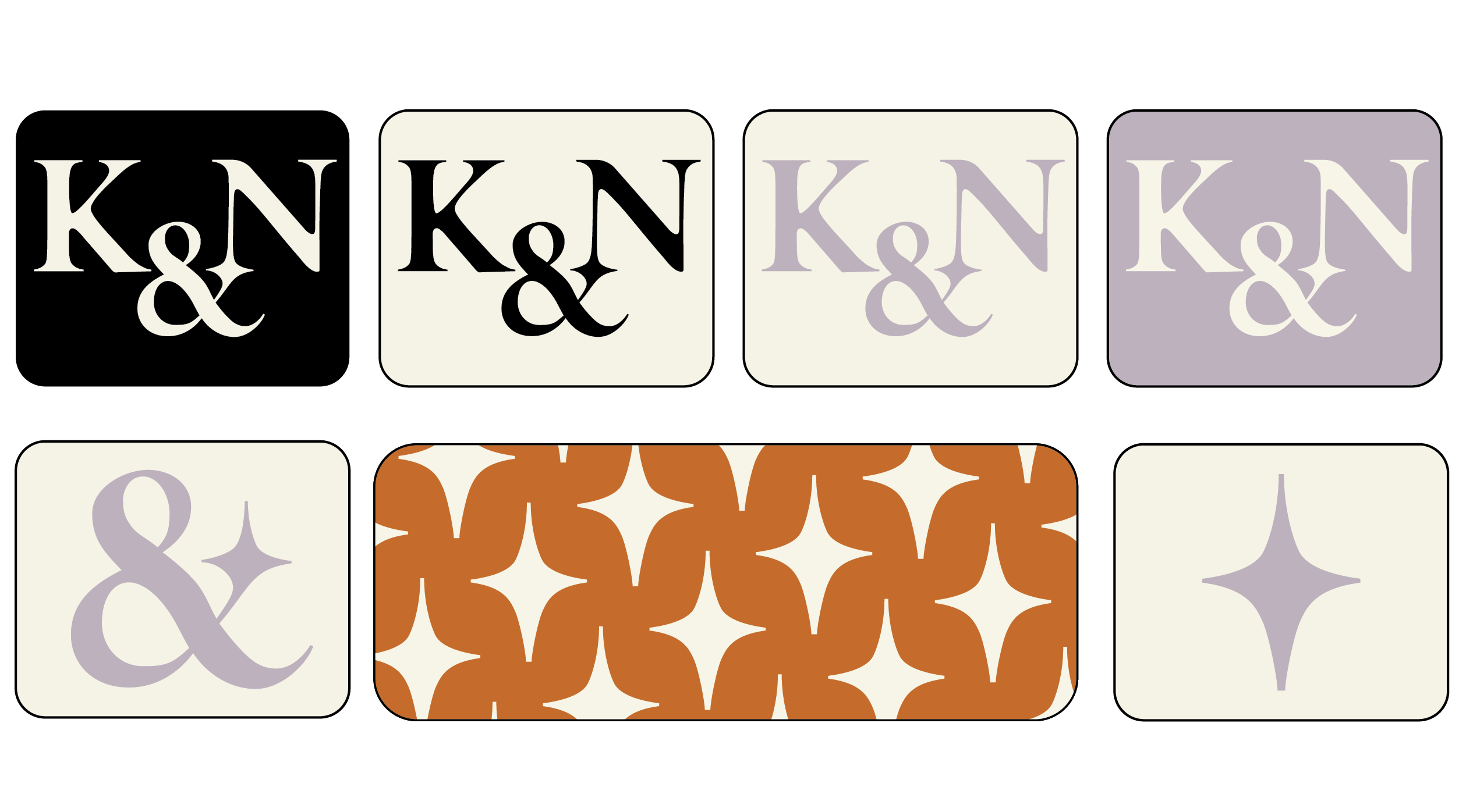
Classic black has been chosen as the primary color for the majority of our text. Its timeless and versatile nature provides a strong foundation for the rest of the palette, ensuring that all text is easily readable and visually grounded. Black's inherent sophistication and clarity make it an ideal choice for conveying information in a professional and authoritative manner.
Light purple adds a touch of formality and elegance to our color scheme. Traditionally associated with royalty and luxury, this soft hue brings a comforting and nurturing quality to our visual identity. This particular shade of purple also holds personal significance, as it represents amethyst, the birthstone of co-founder Nancy.
Off white serves as a complementary color, providing a soft, neutral background that supports and highlights the other colors. Unlike stark white, this subtle shade introduces a clean and formal space that avoids feeling clinical or harsh. Its gentle tone helps to reduce visual fatigue in digital settings but is not essential for print materials.
Burnt orange is selected to provide a bold contrast to the softer light purple. This vibrant hue introduces warmth and energy to the color palette, and the color is reminiscent of the Colorado Monument, adding a sense of place and identity to the brand.
website :
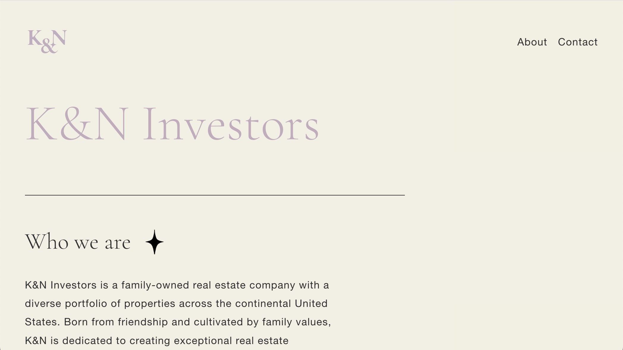
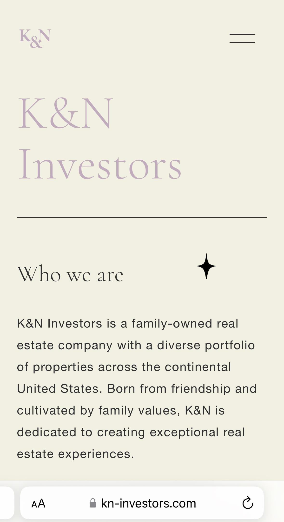
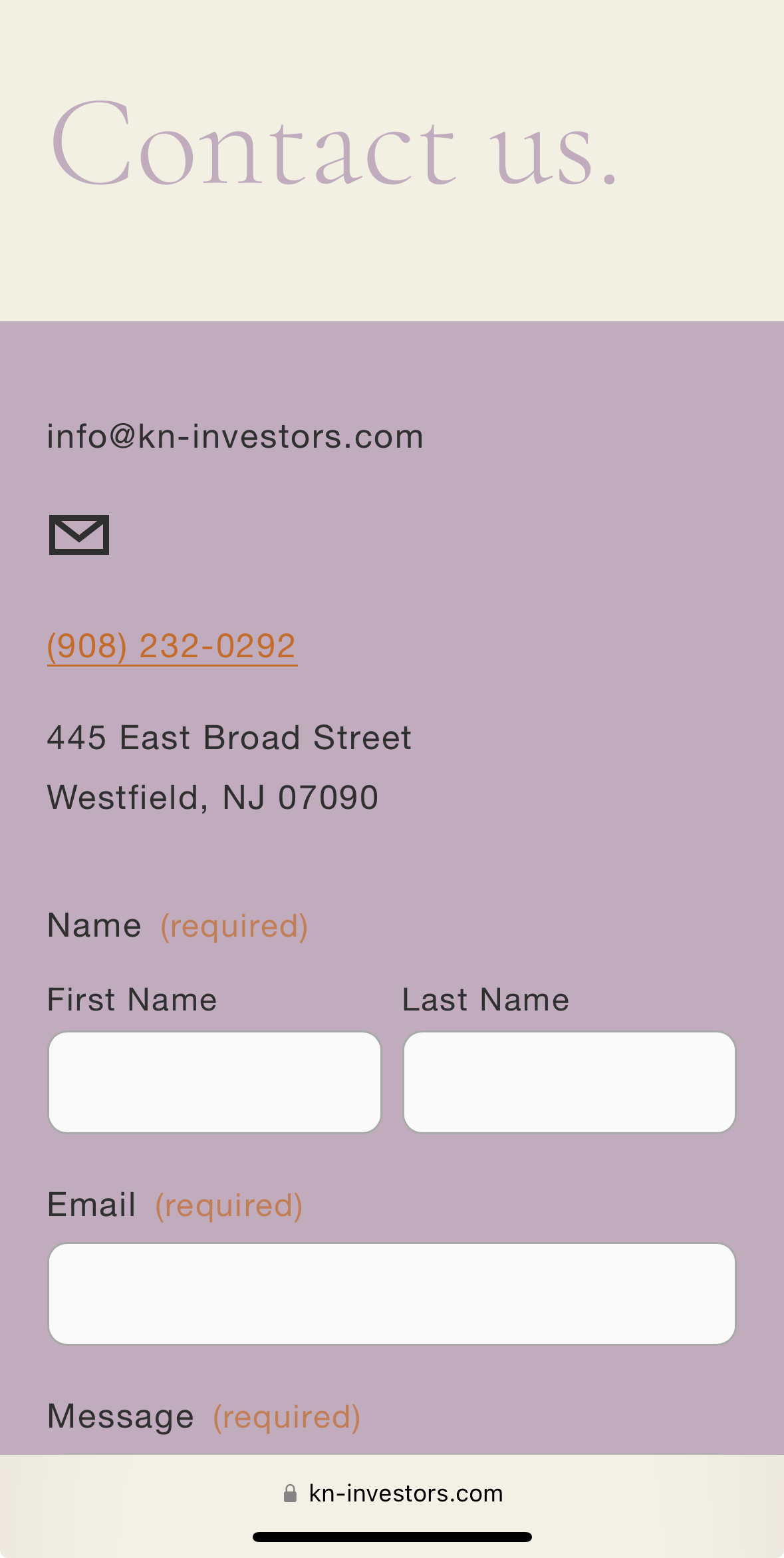
K&N requested a clean, streamlined website design that aligned with their brand identity, reinforcing their business's credibility and providing easy access to contact information. The initial launch focused on establishing an online presence, with plans for future updates to feature dedicated pages for property listings, client testimonials, and philanthropic initiatives.
 bailey foltz
k&n investors
A logo design and brand identity creation for K&N Investors, a real estate investment company
Deliverables: logo design, visual system guidelines, printed assets, digital assets, web design and development
about :
Boilerplate/Mission :
K&N Investors is a family-owned real estate company with a diverse portfolio of properties across the continental United States. Born from friendship and cultivated by family values, K&N is dedicated to creating exceptional [commercial] real estate experiences.
Our mission is to build vibrant communities, uplift small businesses, and stimulate local economies through strategic investments and thoughtful property management.
Our Values :
At K&N Investors, we believe in the power of relationships and the importance of community. Our properties are more than just buildings; they are integral parts of the neighborhoods they serve. Our team brings a wealth of experience and a collaborative spirit to every project, ensuring that our properties are well-maintained, innovative, and responsive to the needs of the community.
Core Tenets :
Family Values
Rooted in the principles of trust, integrity, and mutual respect, our family values guide every aspect of our business. We prioritize creating a supportive and inclusive environment where our partners and tenants feel valued and respected.
Community [and Education]
We believe in the power of community and are dedicated to making a positive impact in the neighborhoods we serve. Our commitment to community means investing in local initiatives, supporting small businesses, and fostering environments where people can connect and thrive.
Relationship-Centric Business Practices
By fostering strong connections with our tenants and partners through relationship-centric business practices, we create spaces that not only meet commercial needs but also enhance the quality of life for all stakeholders.
logo :
For K&N, we opted to create a monogram logo, a choice driven by the desire for simplicity, professionalism, and memorability. The intertwined letters "K" and "N" serve as a visual representation of collaboration—both the partnership between the original founders, Karl and Nancy, and the ongoing, dynamic relationship between the company and its clients.
The design is rooted in a serif font, a modified version of ‘Big Caslon CC Regular’, selected to balance formality and approachability. The pointed serif edges convey a sense of precision and professionalism, while the subtle curves within each character introduce an element of friendliness and adaptability. This duality reflects the company's commitment to delivering meticulous and high-quality service, while remaining approachable and flexible to client needs.
A distinctive feature of the logo is the point of combination between the "&" and the "N." This junction converges into four points, two of which extend back into the letters. This star-like shape symbolizes the company's role as a guiding star for their clients. Just as a star offers direction and inspiration, K&N strives to lead their clients towards success and innovation.
typography :
We selected Cormorant Garamond as our primary serif font due to its professional and sophisticated aesthetic. This font is characterized by its thin strokes, which lend an air of formality and elegance to the text. Despite its refined structure, Cormorant Garamond also features fairly rounded letters and subtle rounded details. These design elements introduce a sense of friendliness and approachability, making it a versatile choice that balances professionalism with warmth.
To complement the primary serif font, we chose Helvetica (Light) as our secondary sans serif font. This typeface is renowned for its clarity and readability, making it an ideal choice for body text. Its clean, straightforward lines provide a perfect counterbalance to the more ornate Cormorant Garamond, ensuring that the overall design remains accessible and easy to navigate. Additionally, Helvetica is widely pre-installed on most software platforms, ensuring consistent rendering and accessibility across various devices and applications.
color palette :
Classic black has been chosen as the primary color for the majority of our text. Its timeless and versatile nature provides a strong foundation for the rest of the palette, ensuring that all text is easily readable and visually grounded. Black's inherent sophistication and clarity make it an ideal choice for conveying information in a professional and authoritative manner.
Light purple adds a touch of formality and elegance to our color scheme. Traditionally associated with royalty and luxury, this soft hue brings a comforting and nurturing quality to our visual identity. This particular shade of purple also holds personal significance, as it represents amethyst, the birthstone of co-founder Nancy.
Off white serves as a complementary color, providing a soft, neutral background that supports and highlights the other colors. Unlike stark white, this subtle shade introduces a clean and formal space that avoids feeling clinical or harsh. Its gentle tone helps to reduce visual fatigue in digital settings but is not essential for print materials.
Burnt orange is selected to provide a bold contrast to the softer light purple. This vibrant hue introduces warmth and energy to the color palette, and the color is reminiscent of the Colorado Monument, adding a sense of place and identity to the brand.
website :
K&N requested a clean, streamlined website design that aligned with their brand identity, reinforcing their business's credibility and providing easy access to contact information. The initial launch focused on establishing an online presence, with plans for future updates to feature dedicated pages for property listings, client testimonials, and philanthropic initiatives.
